Color psychology is a fascinating field exploring how colors affect human emotions and behavior. From influencing our moods to shaping our perceptions, colors play a significant role in various aspects of our lives, including art and design. In this article, we will explore the field of color psychology and discover how it can be used to create meaningful wall art that resonates with viewers on a deeper level.
Colors have the power to evoke specific emotions and feelings, often on a subconscious level. For example, warm colors like red, orange, and yellow energize and stimulate, while cool colors like blue and green evoke calmness and tranquility. By harnessing the psychological impact of colors, artists and designers can craft artwork that elicits specific emotional responses from viewers.
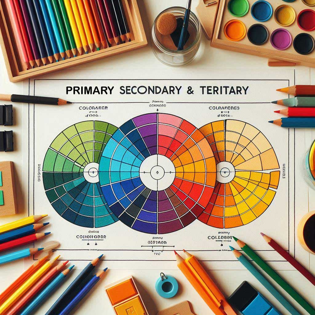
Understanding the Color Psychology
Colors can be broadly categorized into three main groups.
Warm colors:
Red, orange, yellow, and warm neutrals like beige and brown. These colors evoke feelings of warmth, comfort, and energy.
Cool colors:
Blue, green, purple, and cool neutrals like grey and silver. These colors promote calmness, serenity, and relaxation.
Neutral colors:
Black, white, and grey. These colors provide balance and stability and can help to ground other colors.
Which colors should we use for our Walls?
Different colors can influence our emotions and moods in various ways:
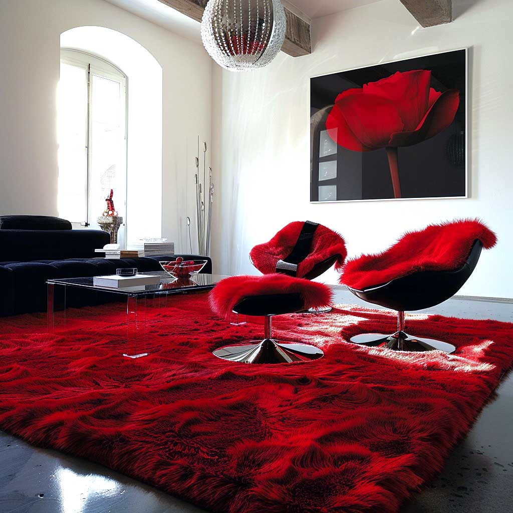
Red:
Stimulates passion, energy, and excitement. Ideal for home gyms, playrooms, or living rooms. The color red can have a profound impact on our emotions and behavior. Here are some ways in which the color red can affect us.
Emotions: Red is often associated with feelings of passion, energy, and excitement. It can evoke strong emotions and increase heart rate and blood pressure.
Attention: Red is an attention-grabbing color and can draw our focus quickly.
Stimulates appetite: Red is often used in food branding and packaging as it can stimulate appetite and increase cravings. – Symbolism: In different cultures, red has different symbolic meanings, such as good luck, prosperity, and happiness in China, while it represents love and passion in Western cultures
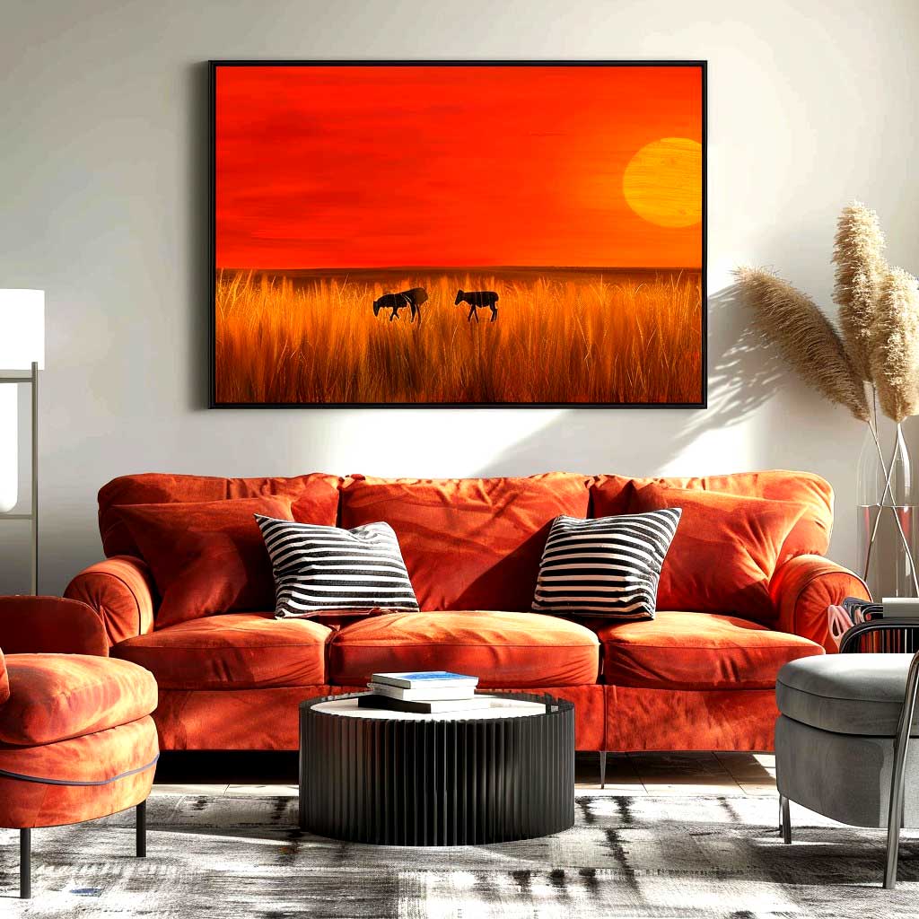
Orange:
Encourages creativity, enthusiasm, and warmth. Perfect for home offices, kitchens, or dining rooms.
Emotions: Orange is often associated with feelings of enthusiasm, excitement, and warmth. It can evoke a sense of joy, creativity, and playfulness.
Energy and stimulation: Orange is a high-energy color that can increase alertness and stimulate mental activity.
Appetite and hunger: Orange is often used in food branding, as it can stimulate appetite and increase cravings.
Mood booster: Orange has been shown to improve mood and reduce stress and anxiety.
Creativity and inspiration: Orange is often linked to creativity, inspiration, and imagination.
Yellow:
Yellow, a bright and vibrant color, can significantly impact our emotions and behavior. Here are some ways yellow can affect us:
Boosts happiness, optimism, and sunshine. Great for bedrooms, bathrooms, or hallways.
Emotions: Yellow is often associated with feelings of happiness, optimism, and sunshine. It can evoke a sense of hope, warmth, and cheerfulness.
Mood booster: Yellow has been shown to improve mood and reduce stress and anxiety.
Energy and stimulation: Yellow is a high-energy color that can increase alertness and stimulate mental activity.
Memory and cognitive function: Yellow has been linked to improved memory and cognitive function.
Warning and caution: Yellow is also used as a warning color, signaling caution and alerting us to potential dangers.
Cultural associations: In different cultures, yellow has different symbolic meanings, such as prosperity and good luck in China, and mourning in Mexico.
Overall, yellow is a color that can uplift and inspire us, and its effects can be quite powerful!
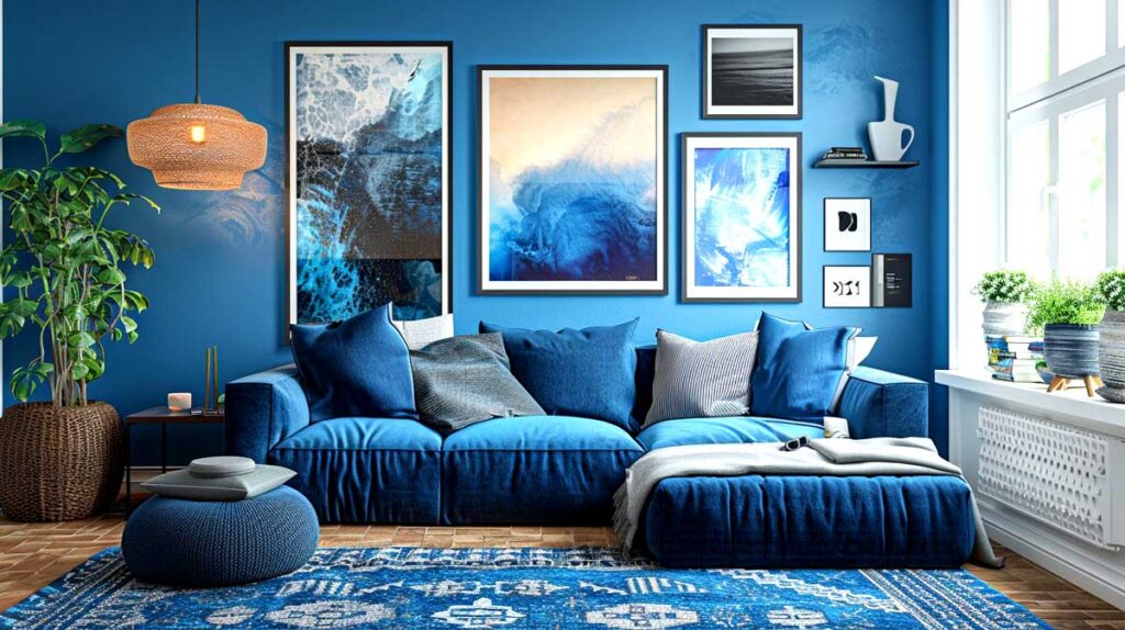
Blue:
Promotes trust, loyalty, and tranquility. Ideal for bedrooms, bathrooms, or living rooms. Blue, a calming and soothing color, can have a profound impact on our emotions and behavior. Here are some ways blue can affect us:
Emotions: Blue is often associated with feelings of trust, loyalty, and serenity. It can evoke a sense of calmness, relaxation, and peacefulness.
Calming effects: Blue has been shown to reduce stress, anxiety, and blood pressure, promoting a sense of tranquillity.
Trust and loyalty: Blue is often linked to trustworthiness and loyalty, which is why it’s commonly used in corporate branding.
Confidence and intelligence: Darker blues can convey confidence, intelligence, and professionalism.
Sadness and melancholy: Lighter blues can sometimes be associated with feelings of sadness and melancholy.
Cultural associations: In different cultures, blue has different symbolic meanings, such as prosperity in Greece and protection in Morocco.
Overall, blue is a color that can have a calming and soothing effect on us, and its effects can be quite profound!
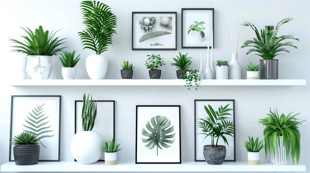
Green:
Balances harmony, growth, and nature. Suitable for living rooms, bedrooms, or outdoor spaces. Green, a balancing and harmonious color, can have a significant impact on our emotions and behavior. Here are some ways green can affect us:
Emotions: Green is often associated with feelings of calmness, balance, and growth. It can evoke a sense of harmony, relaxation, and rejuvenation.
Nature connection: Green is linked to nature and the outdoors, which can promote feelings of freshness and renewal.
Calming effects: Green has been shown to reduce stress and anxiety, promoting a sense of tranquility.
Growth and development: Green is associated with personal growth, development, and progress.
Freshness and clarity: Green can improve vision and cognitive function, promoting mental clarity.
Cultural associations: In different cultures, green has different symbolic meanings, such as prosperity in Islam, good luck in China, and fertility in Africa.
Overall, green is a color that can promote balance, harmony, and growth, and its effects can be quite refreshing!
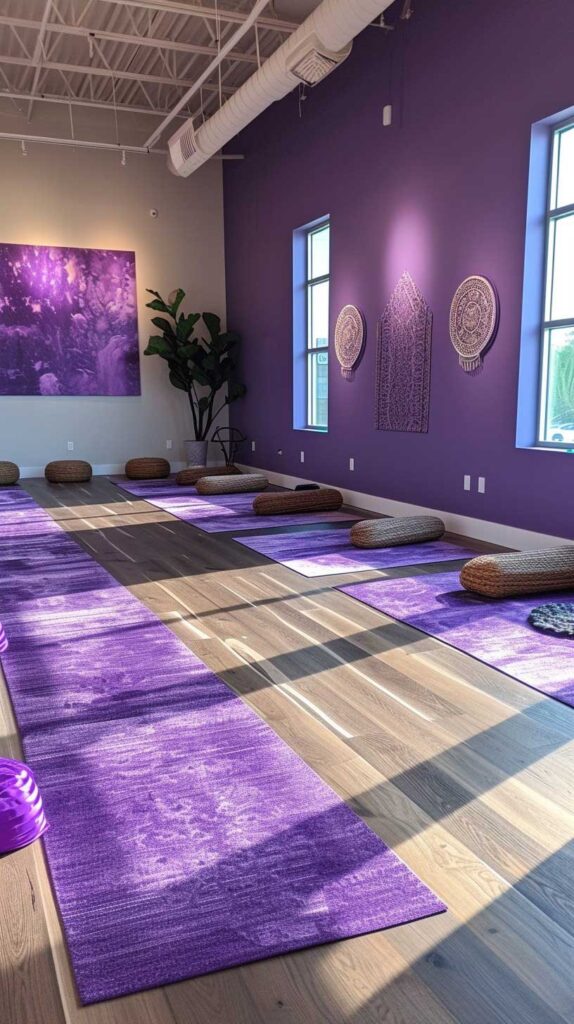
Purple:
Inspires luxury, creativity, and wisdom. Perfect for home offices, bedrooms, or dining rooms. Purple, a rich and complex color, can have a profound impact on our emotions and behavior. Here are some ways purple can affect us:
Emotions: Purple is often associated with feelings of luxury, creativity, and wisdom. It can evoke a sense of grandeur, sophistication, and beauty.
Creativity and inspiration: Purple is linked to artistic expression and imagination, promoting creativity and inspiration.
Calming effects: Purple has been shown to reduce stress and anxiety, promoting a sense of calmness and relaxation.
Spiritual connections: Purple is often associated with spiritual growth, enlightenment, and higher consciousnessLuxury and opulence: Purple is linked to wealth, royalty, and luxury, promoting feelings of grandeur and sophistication.
Cultural associations: In different cultures, purple has different symbolic meanings, such as power in Brazil, mourning in Thailand, and spirituality in India.
Overall, purple is a color that can inspire creativity, promote luxury, and evoke a sense of spiritual connection, and its effects can be quite powerful!
Tips for Choosing the Right Colors for Your Wall Art
When selecting colors for your wall art, consider the following tips:
- Consider the room’s purpose: Choose colors that align with the room’s function. For example, a calming blue for a bedroom or a stimulating orange for a home gym.
- Think about your style: Select colors that reflect your personality, interests, or hobbies. If you love nature, green or earthy tones might be perfect.
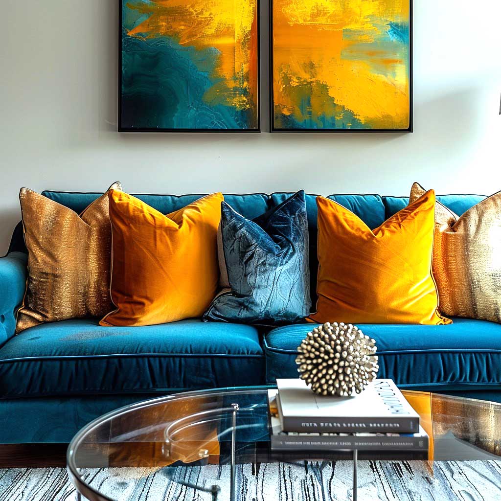
- Balance warm and cool colors: Combine warm and cool colors to create visual interest and harmony. For example, pair warm red with cool blue or green.
- Don’t forget about neutrals: Use neutral colors like black, white, or grey to provide balance and stability, especially when working with bold or bright colors.
- Experiment with shades and tones: Don’t be afraid to try different shades and tones of your chosen color. This can add depth and visual interest to your wall art.
Popular Color Combinations for Wall Art
Here are some popular color combinations that work well for wall art:
- Monochromatic: Use different shades of the same color to create a cohesive and harmonious look.
- Complementary: Pair colors that are opposite each other on the color wheel, like blue and orange, for a visually striking effect.
- Analogous: Combine colors that are next to each other on the color wheel, like blue, green, and yellow, for a smooth and natural transition.
- Triadic: Use three colors equally spaced from each other on the color wheel, like blue, yellow, and red, for a balanced and vibrant look.
Examples of Color Psychology in Wall Art
- A calming blue wall art piece in a bedroom can promote relaxation and improve sleep quality.
- A vibrant orange wall art piece in a home gym can boost energy and motivation.
- A nature-inspired green wall art piece in a living room can bring a sense of harmony and balance.
- A bold red wall art piece in a dining room can stimulate conversation and appetite.
Conclusion
Color psychology is a powerful tool for creating a harmonious and inviting home. By understanding the emotional effects of different colors, you can choose wall art that reflects your personality, style, and mood. Remember to consider the room’s purpose, your style, and the balance of warm and cool colors. Don’t be afraid to experiment with different shades, tones, and color combinations to find the perfect look for your home.
Frequently Asked Questions (FAQs)
- What is color psychology? Color psychology is the study of how different colors affect human emotions, behavior, and perceptions. It explores the psychological impact of colors and their ability to evoke specific feelings and moods.
- How can I determine which colors are best for my wall art? Consider the mood or atmosphere you want to create in your space. Warm colors are energizing and stimulating, while cool colors are calming and soothing. Choose colors that align with the desired emotional effect.
- Can color psychology be applied to other aspects of home décor? Yes, color psychology can inform various aspects of home décor, including furniture, textiles, and accessories. By understanding how colors influence emotions, you can create a cohesive and harmonious living environment.
- Are there any cultural considerations when choosing colors for wall art? Yes, different cultures may have varying associations with colors. It’s essential to consider cultural context when selecting colors for wall art to ensure that they resonate positively with viewers.
- Is it possible to overuse or misuse color psychology in interior design? While color psychology can be a valuable tool, it’s essential to use it judiciously and in conjunction with other design principles. Overusing or misusing color psychology may result in overwhelming or discordant spaces.